Doormat is a new non custodial MPC wallet built and aimed towards retail degens. With a simple oauth login and password, you can securely manage your keys from any device. We recently redesigned our UI based on feedback from alpha testers, and in this post I’ll talk a bit more about why we prioritized this and how it has manifested.
Why bother with a redesign?
The initial doormat UI featured a friendly card-based design, intended to make complex actions extraordinarily simple. After getting feedback from our first cohort of alpha testers we realized that the design would struggle to scale with the product. Additionally it felt detached from the visual styles of the brand itself — we were trying to serve degens with a UI that felt a bit too trad. So we let Katy loose in figma and from that came the cyberpunk bloomberg terminal concept.
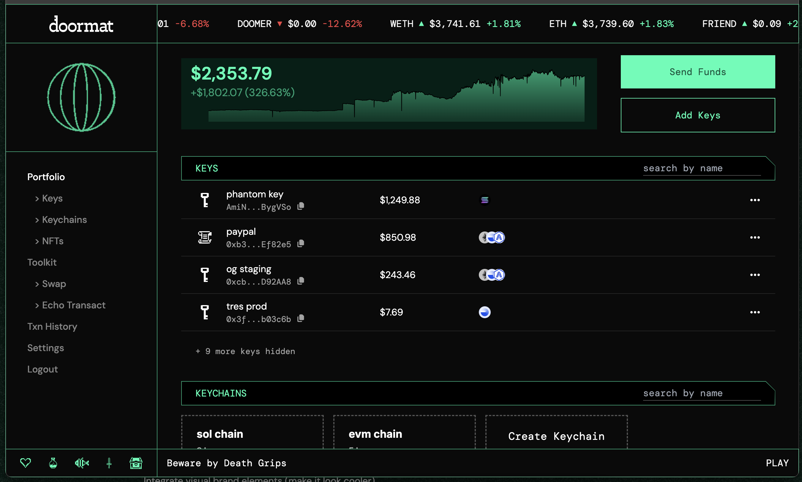
Beyond the UI and visual styles, we also wanted to become a daily destination for folks who are “in the trenches” as Trevor would say. So we mapped out some user journeys and realized we could morph into a portfolio management tool using our existing tech and continue to launch cool features like keychains.
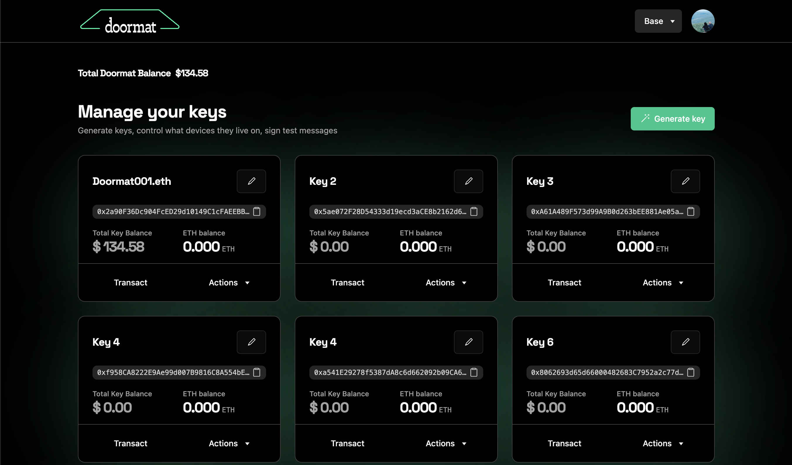 The OG doormat.
Goals of the Redesign
- Become a daily destination for traders
- Improve UX for core key management functionality
- Integrate visual brand elements (make it look cooler)
- Make it easier to add and remove new features we’re testing out
What’s changed?
- integrated, multi-chain UX
- lists instead of cards to preview more info and navigate with less clicks
- visual-first portfolio management
- add fun brand elements (ticker, desktop icons, music player, customize key icons)
Results Pending
Shipping this redesign has helped us refine and clarify our vision for doormat. This is the first of many release updates we’ll share this fall as we ship new features, integrations, and continue to build out our vision for doormat as a trading terminal.
Check out the updates on doormat and let us know what you think! File all bugs/feature requests in our Telegram group chat.